Monday, June 23, 2008
Thursday, June 19, 2008
Monday, June 16, 2008
Schematic Review Feedback
Today during our schematic reviews, the main issue that I wanted help with that dealing with my individual offices. I struggled with deciding whether or not I wanted to completely enclose the offices or leave of the wall that contains the door comepletely. I wanted to know what would be a appropriate for space. My STAR group told me that I should look into using smart glass, so that we people walk by you can see into the offices or if they need to have privacy they can.
Sunday, June 15, 2008
Color Palette Inspiration
Wednesday, June 11, 2008
Codes & Ergonomics Charrette Narrative
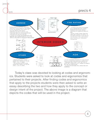
This project is a rehabilitation design and a Class B building. The space has approximately seventeen permanent users. Specific codes of that will be used for this project are based on an occupancy less than five hundred people. The building needs at least two exits. The needs at least one fire rated stairwell and an elevator. Corridors need to be at least five feet wide. As for codes pertaining to distance between furniture and walls, there needs to be least three feet in distance. Doors are a minimum of 2’-8” with a clear swing out to egress. The required amount of bathroom stalls for every fifteen people is one and one fountain is also required.
In terms of ergonomics, there are five aspects to consider. They are safety, comfort, ease of use, productivity/performance, and aesthetics. Safety can be achieved by printing labels that are large enough to be read by everyone. Comfort can be achieved especially with office chairs that adjust so that occupant’s feet are on the floor, or the worksurface or keyboard is at an appropriate height, or preferably both. Pneumatic adjustability is easier to work than mechanical adjustability. Ease of use can be used in providing signage that clearly labels what spaces are. Productivity and performance can be accomplished by providing options to the user, enabling them to easily obtain things. Aesthetics can be obtained by providing signage that is consistent throughout the workplace and is aesthetically pleasing, but also so that information is easily accessible for all signs.
These codes and ergonomics will be applied to the design in that currently the space does not have an elevator and because it is two stories. A lot of the other codes have already been implemented into the design. As for ergonomics this will be achieved through furniture and finish selections.
Schematic Interim Review
Here are a few perspectives that were presented at the Schematic Interim Review.

Large Conference Room

Women's Restroom

Receptionist Desk

Workroom
So of the comments that were given about my project include: thinking about another possible color scheme. Currently the palette consist of red, brown, and beige. These colors don't really depict the type of energy that is going on in the space, so color is definitely something that needs to be looked at. Another concern was that about my space being rustic. The professors wanted to know what made my space rustic and why. They also questioned my use of exposed brick in all of the spaces. Exposed brick is not a good element for the area in which my project is located. So I need to think about when it is appropriate to have have exposed brick and when it is not. They also wanted me to have more fun with the project and not be afraid of using different materials. Overall I feel comfortable where I am with my project. For the schematic review I will definitely present a better color palette and mention my theories and how they are reflected in my design.

Large Conference Room

Women's Restroom

Receptionist Desk

Workroom
So of the comments that were given about my project include: thinking about another possible color scheme. Currently the palette consist of red, brown, and beige. These colors don't really depict the type of energy that is going on in the space, so color is definitely something that needs to be looked at. Another concern was that about my space being rustic. The professors wanted to know what made my space rustic and why. They also questioned my use of exposed brick in all of the spaces. Exposed brick is not a good element for the area in which my project is located. So I need to think about when it is appropriate to have have exposed brick and when it is not. They also wanted me to have more fun with the project and not be afraid of using different materials. Overall I feel comfortable where I am with my project. For the schematic review I will definitely present a better color palette and mention my theories and how they are reflected in my design.
Wednesday, June 4, 2008
Subscribe to:
Posts (Atom)


